Exhibition Ideas

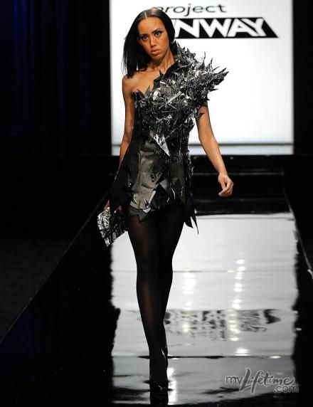
To gain ideas of ways to exhibit my work in the exhibition, I took to Pinterest and artists websites to find exhibitions from fashion and costume that gave me inspiration for my work.

The inspiration that I found has come from designers like Alexander McQueen with his exhibition at the V&A, to the Brisbane Ballet company. I wanted to find inspiration from more traditional clothing exhibitions (like displaying garments on mannequins) to more current clothing exhibitions (like hanging garments). This has, therefore, allowed me get an idea of how I would like to exhibit my work.

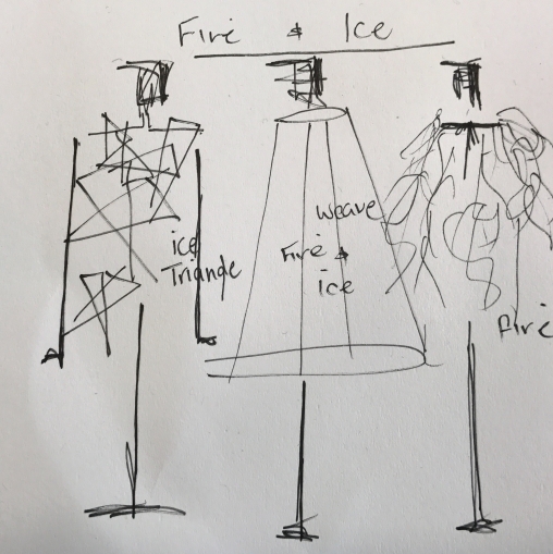
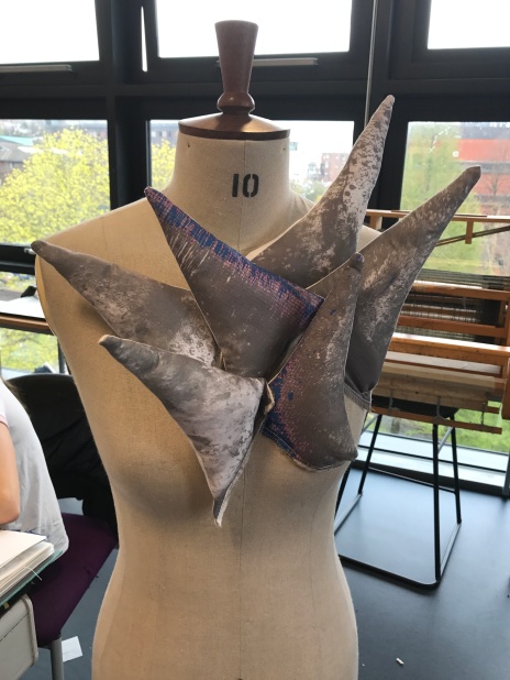
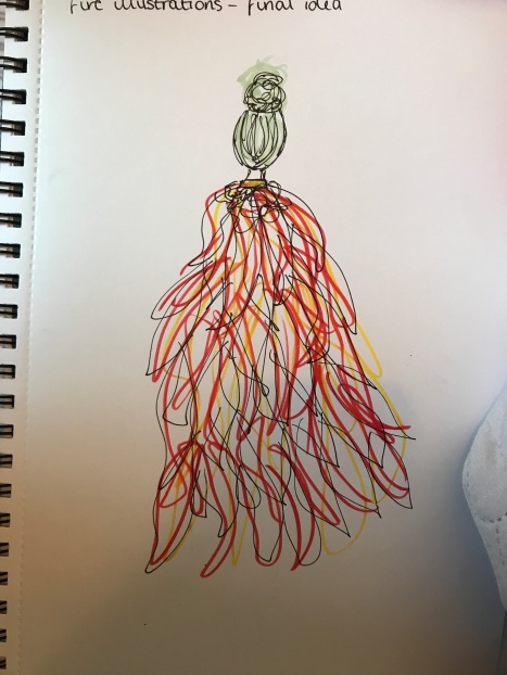
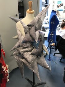
I have decided that I would like a corner to exhibit my work so that I can link back to my original theme of Romeo and Juliet – how? I would like a corner so that I can exhibit only one garment but so that I can have two large photographs, either A0, A1 or A2 sized, so that the fire garment and the ice garment are displayed separately, but I want the photos to face back to back to represent the feud between the houses of fire and ice, like the feud Shakespeare displayed in Romeo and Juliet with the two families. I would therefore like to have the weave garment on exhibition, either hung or on a mannequin, to show the love that the two houses found through their younger generation. I also think that this garment is the strongest garment but also the other two garments look better on a photograph as the model shows exactly how my costume should be worn.

Diagrams of how I plan to exhibit my work:

References:

  • “Claudia Casarino”. Claudiacasarino.com. N.p., 2017. Web. 8 May 2017.
  • Dress Code: High Fashion. N.p., 2017. Web. 8 May 2017.
  • PROJECTS, SPECIAL, and NEWS PRESS. “Every Curve Art Installation | Zoe Buckman”. Zoe Buckman. N.p., 2017. Web. 8 May 2017.
  • “The Brisbane Ballet Connection: New Faces, New Beginnings”. Valerie Lawson’s Dancelines. N.p., 2017. Web. 8 May 2017.
  • “Exhibition”. Pinterest. N.p., 2017. Web. 8 May 2017.
  • “Introducing… The Skillfull Surprises Of Designer And Maker Sarah Parker”. It’s Nice That. N.p., 2017. Web. 8 May 2017.
  • “Exhibition”. Pinterest. N.p., 2017. Web. 8 May 2017.
  • Howarth, Dan. “Alexander Mcqueen Savage Beauty Exhibition At V&A London”. Dezeen. N.p., 2017. Web. 8 May 2017.

Fire Cape

The idea behind the cape is to cut individual pieces of chiffon in a flame-like pattern and then sew it all together. I illustrated how I wanted it too look;

IMG_0289

Again I think this look is successful and strong, but I think it is my least favourite garment because it hasn’t turned out how I envisioned it too look, but I still think that it is really strong. I didn’t get any photos of this garment on the mannequin so I intend on doing a photoshoot next week, after the festival of making fashion show, to enhance and properly display this garment.

Choosing a Song for the Festival of Making

Choosing the right song for a runway show is really important because you want it to have a good enough beat to walk to but you don’t want it the lyrics to become too important and scramble up the meaning behind your garments. I wanted to use an 80s pop rock track for mine because I really like the beats they have but also because some modern songs that I like would be too cheesy and deface my meaning behind my fire and ice – these options where:

  • New Dress by Depeche Mode


  • Strangelove by Depeche Mode


  • Blue Monday by New Order


  • Friction by Imagine Dragons


  • Kids by MGMT


However, in the end I decided that the best song for my three garments to walk down to in the Festival of Making fashion show would be Blue Monday by New Order because the introduction is quite long and has no lyrics on it so it would allow the audience to gain their own opinions on my garments before the lyrics start. I think it will enhance my theme because when I link back to my origin of Romeo and Juliet, you think of the feud their families have which would in effect correlate to a warrior fight-like and confident walk in which the models will walk in time to.

Ice Garment

I wanted to complete my ice garment and sew it all together, however oveIMG_0103
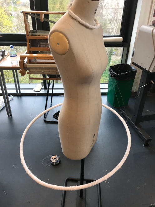
r the easter break I had been worrying about this garment because of its weight and I thought that once it was unpinned from a mannequin and and sewen together it would loose its shape because it wouldn’t have anything else to support it.

Even though it does look really successful the weight of it would completely changes is form, structure and strengthen when not pinned to a mannequin so I had to find a solution to fixing this and finding a way to make it work. For me this meant that I should experiment again with ways to present it and too look back at my origin of FMP, Cirque du Soleil, to find a new idea to inspire me for the ice final garment so that it would still look bold, structured and strong.

Danielle suggested trying to work in a less structured way by pinning the ice triangles onto a long strip of fabric and then wrapping it around a mannequin so that I was free to change how it looked when on a model.

I gave this idea a go, however, I truly hated it. For me it looked dreadful and doesn’t represent me as a costume designer; I honestly felt like it looked ridiculous and lost the whole meaning and inspiration behind my FMP idea. It was a big no from me. After this, I felt like I was having a block with my work and I wanted to work from an actual design instead of pinning things to a mannequin and trying to find a design that way – so I went back to the drawing board and came up with a really strong design, which represented a warrior who was ready for a final fight like the houses of the Capulets and Montagues where in the original play, wrote by Shakespeare.

IMG_0288

I decided that I wanted to work from a small cami top then build upon the cami with the ice triangles and adding the blue chiffon materials from the weave dress to link the two garments together. I thought that if I changed the straps of the top and used the chiffons to braid 3 new straps on the top it would create a warrior feel to it, but also make it look slick, structured and strong. I wanted to then have braids in the hair with the chiffons to create a headband to keep adding the blue colouring but also to enhance the warrior feel.

I think that it gives off the idea that I wanted it to and it also looks really successful, structured and strong. I need to get some black shorts for the model to wear underneath this garment but I think when it comes to the fashion show it will look really successful, warrior like and strong with the help of hair, makeup and styling! I cannot wait to put this garment on the catwalk and show off this ice warrior look.

Finishing the Weave Dress

24th April

Throughout pathway day, I have been working on my fire and ice weave garment, in order to try and get it nearer to completion. At the end of today, I haven’t got much left to do and I am really happy with the outcome of it so far – with this in mind I know of one problem which has already occurred because I haven’t left arm holes but once I have completed the whole garment I plan to work on this as I feel it will have been easier to add in arm holes at the end than adding them in as a design element.

25th April

After yesterdays work, I haven’t got much left to do, when looking at my weave dress. I continued to weave for the first hour and a half of the day which allowed me to successfully complete my fire and ice combined garment. With regards to the arm hole problem, I am relieved because it is easier to put the garment on then add the arm holes one by one – it doesn’t even look like they haven’t not been apart of the design. I asked one of my class members to put on my garment so that I could see what it looks like on.

IMG_0197

I think overall the garment is beautiful and mesmerising and I think this garment is definitely the strongest garment that I have ever created to date. However, one other problem occurred when creating this garment, which wasn’t recognisable until it was placed on an actual body instead of a mannequin, which is one side has rose and gone shorter than the other side; I do really like the not symmetrical placement and think this has added successfully to the design but I will need to create some shorts to go underneath this because otherwise it will be quite revealing for people who come to watch the fashion show. I plan on getting some high-waisted knicker shorts then adding fabric to them which is the same fabric as the ones in the weave dress.

Overall, I think this dress is amazing and successful, even with the problems that have arose I feel that they have actually improved and helped the design of the garment and I am looking forward to seeing my garment in the Festival of Making fashion show.

The Festival Of Making

An opportunity arose for textiles and fashion where we can show off three garments in a catwalk show, which is going to be filmed by companies like the BBC, as apart of The Festival of Making. I originally decided that I would show off my two animal garments and my fire and ice garment but me and Danielle both agreed that it wouldn’t make a good collection of my work because they are too different from one another; with this in mind I decided that I would create three garments for my final major project, one inspired by fire, one by ice and one of both fire and ice. I sketched out some ideas too see what could work but also what I could deconstruct to reconstruct back into one final garment for my final major project.

img_0096.jpg

My three garments would be –

  1. Fire: a cape out of chiffon to create a flowing, fire flame effect
  2. Ice: Digitally printed triangles of my ice photographs
  3. Fire and Ice: a weave using the colours of fire and ice

Fire Cape

After sourcing chiffons from a local shop, Cheapest Fabrics, I began to cut fire flames out of the chiffons so that the cape would be make from fire shaped patterns instead of one piece of material

IMG_0105

Ice Garment

Moving forward from the ice neckpiece, I began to pin all the different sized triangles onto a mannequin to see the effect it would give off as a dress.

All I really need to do now with this garment is sew them together, I would like to add some other triangle textures using a stronger material to get enhance the effect of ice – I saw something similar on the show Project Runway, season 8 episode 3 (Its a Party) where April Johnston used only materials from a party store where the effect of the garment reminded me of ice.

fghj

Fire and Ice Garment

This garment would be a weave on the loom I created out of a choker and a hula hoop.

Fabric Costings

Shop: Cheapest Fabrics

Price: £43.50

Fabric Amount: 20 meters of reds, blues and orange chiffons

Hula Hoop Weave

I decided that I wanted to create one garment that had a base of weave inspired by Viktor and Rolfs’ weave work.

With these inspirations in mind, and looking back at my own illustrations I wanted to make a warp for my weave that wasn’t so literal; I decided that I wanted to make a dress out of a choker and a hula hoop as a base for my warp. I made a wire choker and wrapped it in tape, wading and white cotton and I wrapped the hula hoop in white cotton to match the choker. I decided that my warp would be out of fishing wire to create a stronger loom, but also so that a colour wouldn’t take away from the weave effect.

IMG_0090

I think that this piece will be really successful when I have completed it and it will definitely be a WOW garment. I now need to source fabric for this garment.

Digital Print Triangles

Using my digital printed samples I began cutting them into triangles and filling them with wading so that I could create possibly a structured neckpiece. I began by cutting the prints into half, but on the diagonal bias to get the triangle shape, I then cut a similar sized piece of cotton or felt to give it back so that I can wad it out. I decided the best way for me to create these triangles would be for me to use the overlocker machine because it creates a neater seam line; I overlocked two of the three sided then, turned the triangles inside out, stuffed with wading then overlocked the final side.

Once I had then created all the triangles I decided to start to pin them onto a mannequin to see how I should move forward with this process.

IMG_0088

I think that, overall, the triangles look really successful but I think that I want more drama within the piece so I plan on creating two more sizes of triangles and upscaling them, so I can achieve more drama.

Digital Prints

After creating collage illustrations using my own photographs, I decided that the best way for me to progress with my work would be to create some digital prints using my photographs of the ice textures. I printed two onto a sample strip before printing larger scaled ones, which I was relieved that I did that because it allowed me to see that the digital printer needed to have the ink crates cleaned because it caused my prints to come out not in the correct colours. Instead of having grey, black and white prints I had grey, blue and pink prints.

IMG_0180

However, even though the colourings on these prints weren’t correct, I do really like them because they do still give off the impression of ice because blue is still a cold colour and even though the pink is a warm colour I could use these prints further down my garment to represent the fight / mixing of the two elements both fire and ice.

I now plan on creating larger samples using more of my ice photos to see what outcome I get, and I want to then cut them into different sized triangles, filled with wading to created 3d icicles.

Developing fashion illustrations

Developing on from last week where I worked on face illustrations, I decided that I wanted to develop this skill further and produce illustrations on potential garments for my final major project. I decided that I would also use photocopies of samples from my book to help me illustrate so that I used collage, texture and simple drawing to enhance the theme of fire and ice.

I really like the outcome of these illustrations and I think they look really effective. I feel that they represent my theme of fire and ice in a unique and unusual way because they aren’t so literal in design idea, however the fabric choices will be more literal because I will want to use softer fabrics for fire because the substance is more fluid, whereas, I want to use stronger fabric for the representation of ice because the substance is strong. In some of the designs I wanted to think of the placement of where fire and ice could be, for example, if you think about their substances ice would be on the lower part of the garment because it is heavier whereas, fire would be higher because it is lighter but then you could think about where they would be seen in reality, because ice would be higher up because it hangs from roofs and windows in the form of icicles whereas fire would be lower down as they usually start towards the ground instead of in the air; therefore, the placement of fire and ice in each garment depends on the type of literality you want to look at it from. I definitely think that I can use these illustrations to create a final garment, or more, to represent my idea of fire and ice.

However, after these illustrations had been evaluated I began to develop and refine some of the illustrations by photocopying them onto acetate and sewing into them, before placing them over backgrounds.

I think these where the most successful of all the illustrations because it allowed volume to be created and more textures and patterns to develop, within the illustration. I would like to use one of these as the idea behind my final garment but I may take aspects from all three of them too. I am unsure how I will develop these into my final garments at the moment.